I joined the Quilt Design A Day group on Facebook in February, having been inspired to design just for the sake of designing and creating (and building up my EQ7 muscles!). Each week, a member is in charge of posting “sparks” – a photo they’ve taken and then pulled some of the colours out to make a palette. Everyone else then uses the shapes in the photo to inspire a quilt design, and the colours to, well, colour it! Last week was Medallion Quilt Design Week – for 7 days, we built up a medallion-style quilt, or for some, a row-by-row quilt.
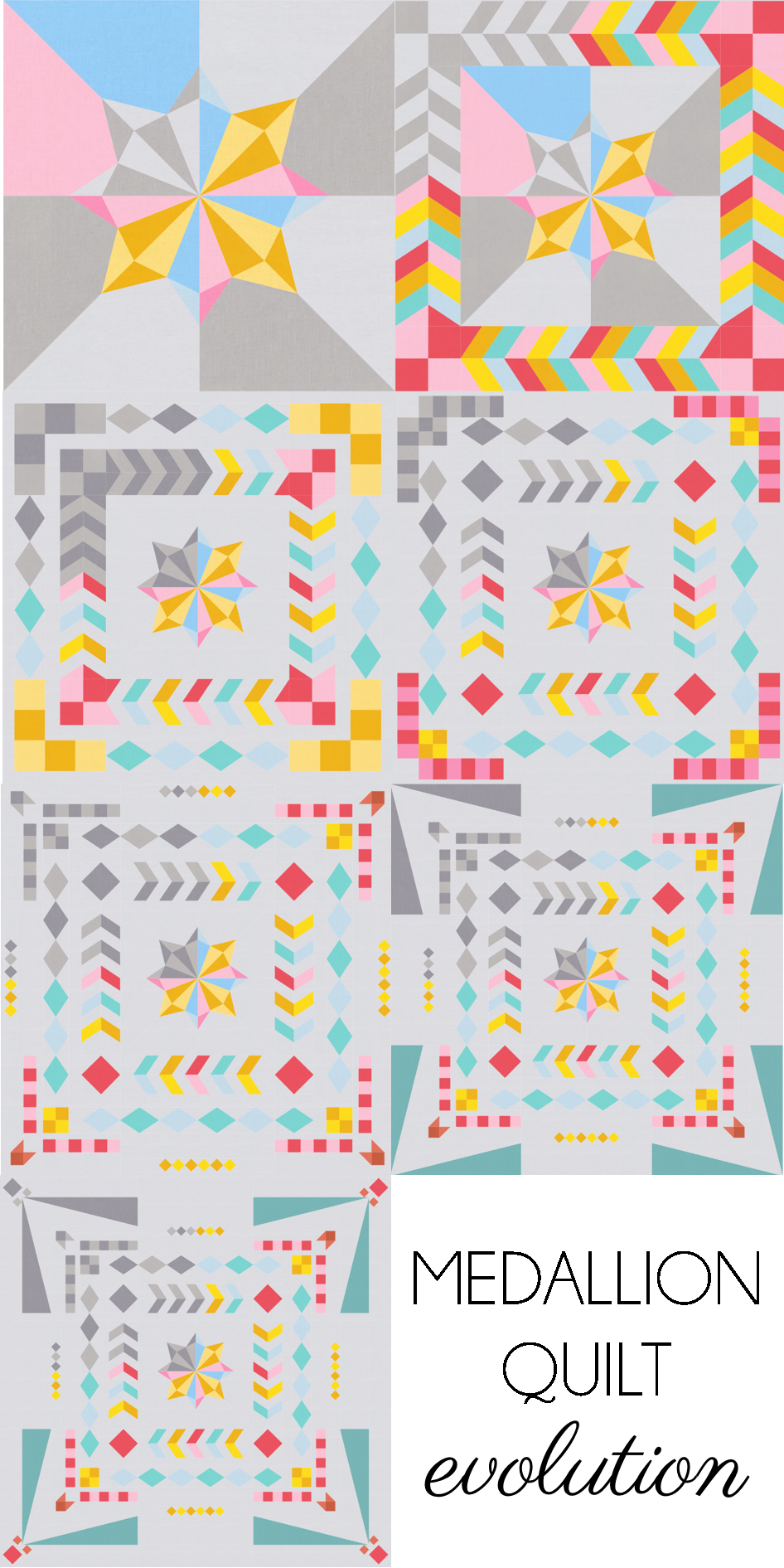
I was really looking forward to this week, but I found that it was quite a challenge at first. You can see that by day 3 I had already started to change my original design!
I knew I had to start with a star of some sort – that’s just who I am! I was also inspired by Gemma’s latest design to do the one-quarter-greys, using a mid- and dark grey to keep the contrast. I found the alternating colours in the centre too distracting, so I swapped it out for the background grey. I liked the added breathing/negative space but then found that borders 1 and 2 were a bit too chunky and heavy! So I changed them next.
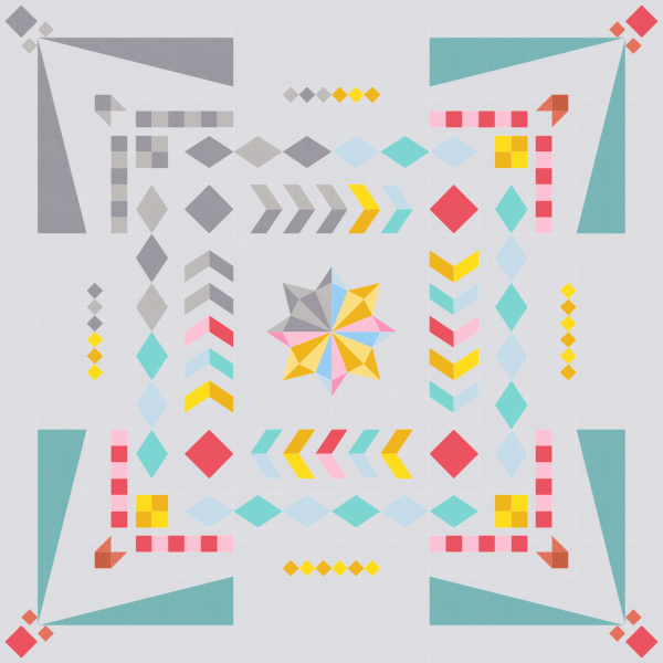
On day 4, I changed the previous borders to add more negative space by removing every second chevron, and minimising the four-patch blocks. On day 5, you can see that I minimised the previous day’s border too from rectangles to squares! Day 6 took a sudden change of direction by using a large border to create a frame (and also the first day I didn’t change previous days’ work!). And the final day, brought a little more corner detail.
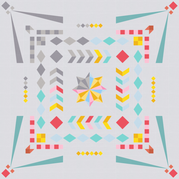
This is where I left it at the end of the challenge, but while writing this post, I had one more little play…
Ahhh, yes, I like that! Not quite so clunky chunky.
I really enjoyed this challenge. Yes, I found it hard at times, but that’s what makes us grow us designers! Learning to identify what aspects we like or dislike, practicing how to change that which we don’t like. It was also scary not knowing what was coming next design or colour wise, so I did play it safe and decided early on to keep to the same colours, occasionally introducing a darker or lighter shade, and to also stick with simple geometric shapes. I loved having the light vs. dark shades playing off of each other, and the amount of negative space I ended up with would be so much fun to free motion quilt! If I was to change one thing overall, I think I’d have started my borders on a smaller scale. Having the first border be a thicker one restricted my further borders to be thinner so that it didn’t look like a chunky mess. I can’t wait for the next medallion week challenge!
You can see the rest of the members’ medallion quilts in the group – it’s a public group, so you can see everything without joining. There are some really inspiring quilts and shapes!


elsa says
Love the process you’ve gone through with this design ~ it’s really lovely. The pointed corners really make it so much more distinctive.
Are you going to publish it? I sure hope so ~ I love it!
(And, something interesting ~ I didn’t even notice the grey part at first ~ I only saw the color).
Brianna Robertson says
Cool evolution! I like negative space in medallion quilts, leaves somewhere for the eye to rest. I just bought EQ7 and I’m excited to figure it out and start designing – different than my graph paper 🙂