I am really loving reading all of your comments from yesterday’s giveaway post! It was a little nerve-wracking asking for honesty, but I’m glad I did! You’ve been so helpful! I told a couple of people it’s like proofreading your own assignments – eventually it just all looks ok to you even though you know it’s not right and thus having someone else’s views and opinions can help. You’ve helped pick up a couple of broken links that escaped my notice, and have given me some pointers like making the Page tabs more noticeable and to get working on the Tutorials page as soon as possible as it seems you’re rather impatient for it! The reason it’s not up now is that the coding I used in Blogger wouldn’t copy and paste across nicely. So I have to start from scratch, but that does mean I can set up a nice system from the beginning like making categories for quilt blocks, sewing tutorials, free patterns, etc. And my husband is looking forward to the challenge of making it how I want – yay!
As for the new look, there’s definitely 2 groups of people – those that love the clean, modern look, and those that think it doesn’t look as “homely” and warm and friendly. I’m not offended at all, but I’d really love to hear if you have any ideas as to how to make it seem more warm and friendly! I want this to be a place you want to come to, after all, what is a blog without the readers?! I used to have a couple of things like a Recent Pins widget showing the last 6 things I Pinned – is that the kind of thing you’re meaning? More of “me”? Let me know!
Ok, so let’s move on to the celebrations! First up, we have a coupon code for my Japanese fabric shop! I’ve added a few new bundles this week, like neon-bright Suzuko Koseki, beautiful florals or sweet Japanese strawberries. Use the code HOUSEWARM15 to get 15% off all fabric, patterns or quilts until Sunday (Japanese Bundle Club excluded)!
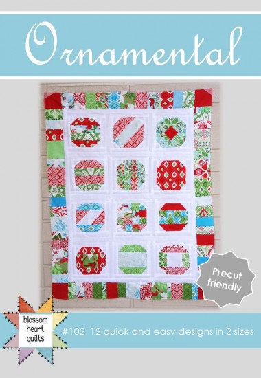
As well as blogging here, I also contribute at And Sew We Craft where we’re currently sharing Christmas In July! To celebrate, head on over to win a copy of Ornamental.
And it’s almost as if Craftsy knew I was moving to WordPress and decided to hold a huge sale in my honour! Alright, so it was just great timing on their behalf, but each day they have a range of classes on sale for up to 75% off! Yesterday I snapped up Sarah Fielke’s class for just $9.99! And in fact as of time of publishing, it still is, but only until midnight Craftsy-time, so if you’re interested, be quick!
Check back tomorrow for the final day of housewarming celebrations!
*happy Craftsy affiliate


Jan says
Your new website looks great to me. I don’t really pay too much attention to how a blog is designed (unless the font used is hard to read). I read blogs to get ideas and to learn new techniques or perhaps even finding an easier way to do a technique.
Mara says
I loved your Pinterest widget, is it easy to put in? Maybe not so bright background white or is that just me because it is 4AM and I am taking care of my sick baby.
Becky Greene says
Why does your Contact Page have “PIC” above the form? Love the look, but your content is what makes the blog great!
Becky Greene says
Also, is there a way to put “Older Post” and “Newer Post” links at the bottom of each post?
Jessica says
I like the clean look. The picture of you makes it personal and welcoming. Sorry I can’t be more constructive!
Suz says
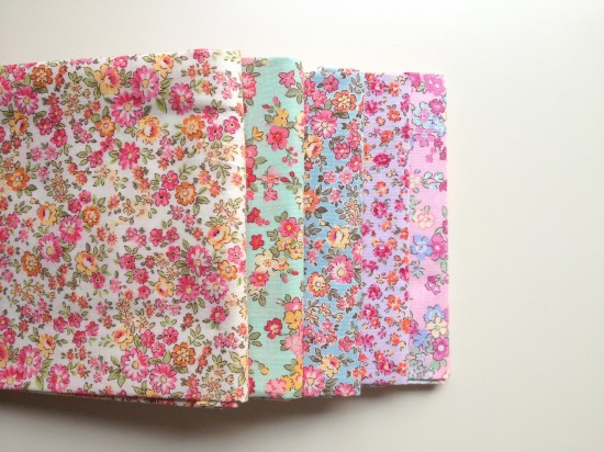
I’m visiting again! I’m wondering whether your title would look ‘warmer and more friendly’ in a chunkier font, in maybe the pink or jade colour? Maybe just tweaking it like that will be all it needs ….. I love your floral fabric featured here today! I’m off to check out your shoppe!
Jennie says
I love it, of course. If anything, you could put some sort of textured background on the very edge of it, but I really, the screen I’m looking at right now washes everything out a bit, so that might be why. I’d add a related posts plug-in (I use YARPP), as it helps for exploration. However, I love your font choices, new colors, and new graphics.
Rebeckah says
Clean and simple is great. I HATE when people have huge photos as their headers and you have to scroll down a whole page before you get to the posts.
Fran says
I really like the idea of the Recent Pins widget, that would be a great addition!
Karen says
I am not sure what people don’t like…maybe if they want more pictures? maybe a tab of your projects and not just tutorials. I personally like the look
Shawn says
Your new blog is so cute Thank you
(smjohns63 at yahoo dot com)