As many of you will know, I love playing around with my blog. As my husband knows, it’s usually after about a year of the same, I feel the urge to change things up! Last year, it was moving to WordPress! Best blogging thing I ever did, by the way, and I wish I had done it sooner. This year, I made it to the 14month mark before deciding it was time for a new logo.
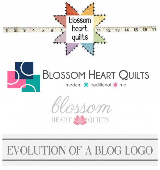
Now, I’ve had a couple of different logos throughout the history of Blossom Heart Quilts, but none have ever really gelled for me. I did like my first HST star for a while, but it wasn’t really ‘me’. And the coloured squares and circles… well, there’s a reason why I just stuck with a dashed circle for everything else! Although I did like the little suns in the tagline!
My blog name came from my old personal blog that was simply Blossom Heart. I drew inspiration from cherry blossoms that I loved so much, and added heart, because, well, pretty. I was even going to use the Japanese for Blossom Heart, translating as “love blossoms”, but it was already in use. Back then I did use cherry blossoms for my blog stuff, but moving on to Blossom Heart Quilts, plus the whole living-in-Japan aspect, I felt it was too cliched. Don’t get me wrong, I still absolutely adore cherry blossoms, and March/April is my favourite time of the year between the spring weather and all blossoms! But I didn’t want to be defined by this period of our life. That and I couldn’t work out a clean and geometric way to use a cherry blossom!
But late one night while my husband was away, I was climbing into bed when out of nowhere – I hadn’t even been thinking about getting a new logo – I was struck with inspiration. A lotus flower. I grabbed pen and paper and roughly sketched down what came to mind. Why a lotus? The pink lotus flower is the mascot for Chiba city, also known Chihana-chan (hana is Japanese for flower, and -chan is the cute/child suffix for names, as opposed to -san which is the honourable suffix). So it has the sentimental, but not so obvious, attachment to our time here in Japan. Also, it’s pink. I’m not a really girly, pink-loving person, but I do love pink flowers. And finally, it’s graphically beautiful! I like geometry and symmetry, and a lotus has it.
Up until now, I have done all my blog by myself. The only other help I have had, other than in-house assistance from my husband, was some technical assistance setting up some software right at the very beginning from Jennie at Clover and Violet. But this new logo was something I wanted some professional assistance to achieve the look I was going for. I loved the work of the designer who did the Make Modern website, so I contacted Julianna at JM Design Studio myself.
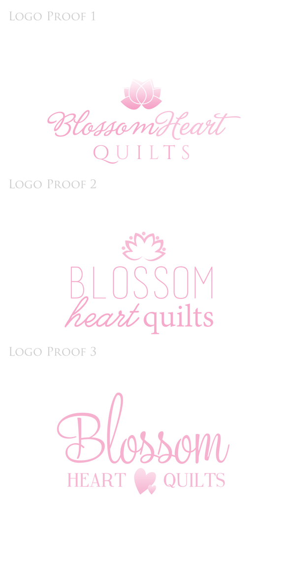
Julianna was so lovely to work with! I created a mini Pinterest board of inspiration to try and portray what was in my brain, and also tried in words to describe what was in my head. She got back to me with three similar but very different ideas to start off the process.
I gave myself a few days to think about it, talked with a couple of friends whose design aesthetics I love, let it all percolate for a while. At first I was really drawn to the logo in Proof 2, but after those few days, I realised I liked the first one better. I also changed my mind about font combinations and where to put the logo. I also knew I needed a different shade of pink – saturated but not too bright – and a dark grey title.
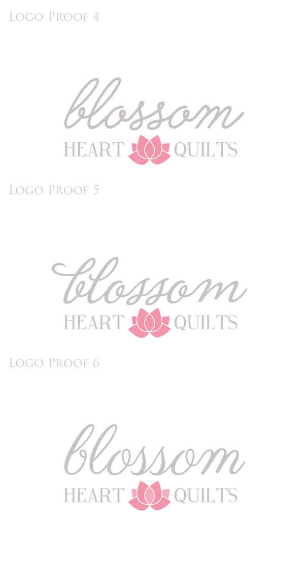
 Julianna took my notes on board and came back with three more options. First of all, the perfect shades of pink and grey! But again, I let it stew for a couple of days, looking back at the proofs every now and then. At first I was drawn to the second proof, but after time, I knew the third proof was perfect.
And now we are here. I’m making a few other changes – a new profile picture and newly-coloured social media buttons to start with! I’ll share some more about the changes going on next week once I’ve had more of a chance to work on them. If you’re reading this post via email or a reader, you’ll need to click through to see it all. But for now, that’s the story of my new logo! One that will last a lot longer than just 12 months – forever is certainly the plan!
With many thanks to Julianna for being such a great designer to work with and for letting me share all the proofs here!


Michele says
I like the new look and thank you for the insights on how this works. I’ve been searching for a logo/website/blog designer to help me revamp mine and set up my new business website and I’m definitely going to check into what Julianne has to offer.
Amy, a redeemed sheep says
I love the new logo! Simple and sweet. I get in the mood to change mine every year or so, too. I haven’t found my forever one yet. You inspire me!
Carla says
The talents of a professional graphic designer can never be underestimated. I do not have their skills, but I am lucky enough to work with many talented designers in my non-sewing day job.
I like how the new logo is a blossom and has a heart-like aspect to its shape too. It reflects your name.
Cassandra says
Thanks for sharing this very personal process. I love the way you worked through it and the final result has the perfect mix of sentiment, graphicality and legibility! Love it!
Teje says
Looks beautiful! You made good decisions. x teje
Carole @ From My Carolina Home says
Your new photo is lovely! The new look is exciting, and I am looking forward to even more great posts.
Carolyn says
Hi Alyce, I always love reading your blog and yes I really like your new look and your new pic is lovely. I would also like to make a move to WordPress but not sure if I will lose all my posts on Blogger. I wonder if you could give me a heads up on this? Many thanks.