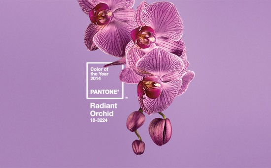
The news is out! Pantone have announced the Pantone 2014 Color Of The Year – Radiant Orchid! To quote Pantone:
An enchanting harmony of fuchsia, purple and pink undertones, Radiant Orchid inspires confidence and emanates great joy, love and health.
Is that enough to convince the purple-haters out there to get on board with Radiant Orchid?
I must admit to being sad to say goodbye to Emerald – one of my all-time favourite colours – and jumping across the colour wheel to purple. And while it’s not the rich, jewel tone I usually favour for purple, I’ve been slowly embracing all the purples. At least it’s not eggplant!
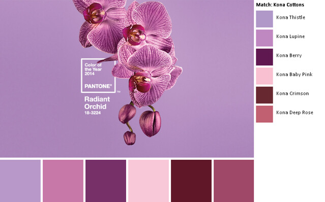
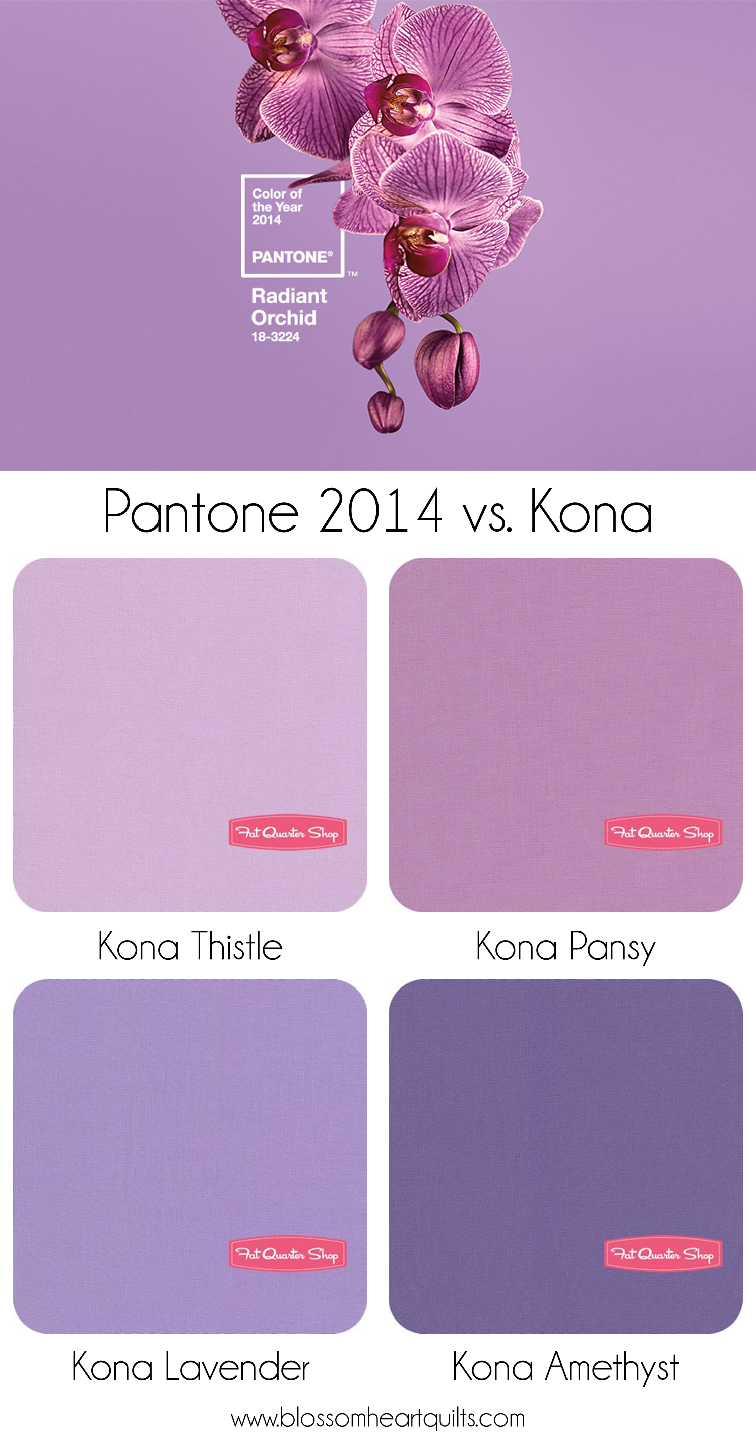
I ran the image through Play Crafts Palette Builder to pull the Kona colours. Comparing it to my Kona card, Thistle feels a little pale and I think Pansy would be the best match with a bit more depth to the colour.
Two more options would be Lavender or Amethyst (not as blue in real life!). These have a blue undertone as opposed to a pink so would be good options if you needed a cooler version of Radiant Orchid. However the description does say that Radiant Orchid has pink undertones, so it’s not strictly Radiant Orchid! But it’s all dependent on your mood, your screen resolution, your lighting, and the dye lot of fabric anyway.
Is this one colour trend you’re going to jump on board with or steer right away from it? Purple certainly is a bit of a “controversial”colour!
Find more Radiant Orchid inspiration at Mood Board Monday.


Paula says
I’m a purple lover and while I do tend more towards the deeper richer tones I do like the more muted shades as well. Looking forward to hopefully seeing a little more purple around in 2014.
Julie says
Actually having the colors in person it is almost perfectly Lupine.
Teresa Nance says
I love purple. It and red are my two favorite colors!!!
Tami Chaulk says
Radiant Orchid is beautiful! My daughter would go nuts over all these pretty purples!
Andrea says
THIS is a color I can live with. Long live “lila” (German for lilac/purple)
Sandra says
I definitely could use this colour better than the emerald. I’d love to work with those Kona colours you are showing, and combine them in one quilt: Pansy, Lupine, Lavender, Thistle with a pop of Berry or Deep Rose; Love it!!!
Kathy @ Kwilty Pleasures says
Not a great color for my eyes…nothing in my stash…probably true for many. Could be why it is being marketed…if it is the color of the year, many will buy it. Will see how designers use it.
Leigh Anne says
I’m hoping that since it is the color of the year we might actually see a few more manufacturers include purple in their fabrics. It’s a popular choice for customers and hard to find in many different patterns
Patty says
Not really excited about this color. I guess I am not a fan of purples.
Cassandra says
I too like the richer tones but this one is pretty as well!
Anne @ play-crafts says
I am hopeful that this means we’ll have more purple options in fabric over the next year. It’s a color that’s been tough to shop for!
I don’t think the background color is actually the Pantone color. The Radiant Orchid chips are redder and a bit less pale:
http://www.pantone.com/pages/index.aspx?pg=21131
When I ran the chip picture through the palette builder, I got Kona Violet as the closest match. 🙂